Behind-the-Z: The Art of Cryo
An in depth look at the unique art behind the sci-fi board game Cryo.
![]() Our Behind-the-Z series takes us on a tour of Cryo through the unique art that brings life to the cold planet and its dangers. Z-Man Games Managing Art Director Samuel Shimota leads us through the process of creating art for the game while breaking down not only his own experience and inspirations, but the collaborative effort of the entire art team.
Our Behind-the-Z series takes us on a tour of Cryo through the unique art that brings life to the cold planet and its dangers. Z-Man Games Managing Art Director Samuel Shimota leads us through the process of creating art for the game while breaking down not only his own experience and inspirations, but the collaborative effort of the entire art team.
Creating art can be an existential struggle. For me, it can be like suddenly realizing that my soul is tied up, and I can hear a freight engine coming down the tracks. It can feel like picking a fight with failure. Sometimes I get halfway through a project, look over what I’ve done, and feel embarrassed or hopeless. But I’ll rally myself, and the results will be better than I could have ever imagined. It can be a wild and emotional ride! Cryo was one such roller coaster of a project.
I grew up on Saturday morning cartoons in the 80’s and comic books of the 90’s. In college, I discovered manga and anime. Sci-fi books and TV, movies, videogames; my media influences are too long to list, and the depths of my nerddom are beyond where the sun can reach. Suffice to say, I have lived and breathed this stuff since childhood. In particular, it’s hard for me to fathom just how influential Franco-Belgian bandes dessinées–comic books of western Europe, or “BD” for short–were for me.
My parents prioritized traveling when I was a child, and I ended up with many The Adventures of Tintin and Asterix the Gaul books in my collection. Later in my life, I would learn that these were part of a larger tradition. As an adult, I found the work of Jean Giraud (otherwise known as Mœbius), whose imaginative work, precise yet loose lines, command of color, and sense of visual composition, are unmistakable. When I found it, it stayed with me.
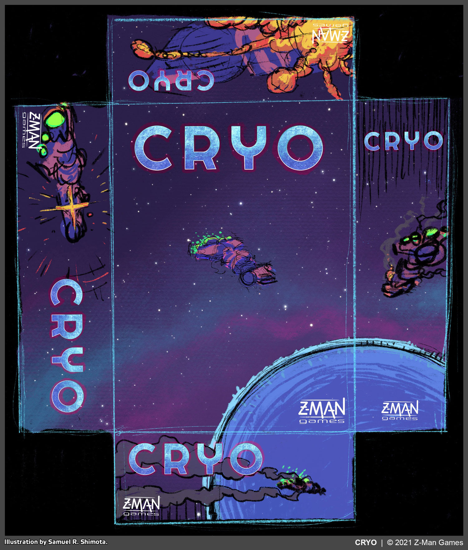
Packaging sketch created with Procreate on an iPad Pro. We had an early concept of doing each side of the box as a ‘comic panel’; showing the process of the ship flying, exploding, and crashing. Though we didn’t go in that direction, this sketch heavily informed the final layout and color scheme of the box lid.
Enter Beyond Jupiter, a prototype game by Luke Laurie and Tom Jolly. Due to a large volume of more-urgent work, this prototype was floating around the Z-Man office for quite some time before we were ready to dig into it. During that time, it was omnipresent in our minds. We spoke of it often, in a wistful, “I can’t wait to start working on that” kind of way. We were especially excited at the prospect of doing an original game in a science fiction setting.
When the time finally arrived to start work on Beyond Jupiter, we decided to take a critical look at how we do “Z-Man original games” (a classification we use internally to describe games that don’t fall within our established IP lineup–e.g. Pandemic–or revised editions). We’ve put a lot of love into our originals of the past; notably Spynet, Fae, Noctiluca, and Mesozooic all have themes and art styles that were lovingly built from the ground-up. Beyond Jupiter felt different, though. It was a little more complex than our other originals, and our team hadn’t yet done any hard science fiction.
We have a lot of nerds on-staff, with a lot of varying opinions about what makes “good” science fiction (“water cooler” discussions at Z-Man are something to behold). One thing was unanimous, however: we all saw fertile ground for making a real stand-out game, both visually and thematically. Beyond Jupiter was a great prototype with very well-integrated theme and mechanics. It also had a lot of room for narrative exploration, and, visually speaking, it was practically a blank slate. As our Development staff began working on fleshing out the theme that would eventually turn Beyond Jupiter into Cryo, I recognized an opportunity to feature an artistic style that speaks to my own aesthetic interests–something akin to the BD (bandes dessinées) styles I love so much. I jumped at this chance and made my visual vision pitch to the rest of leadership. Their interest was piqued, and the gears were set in motion.
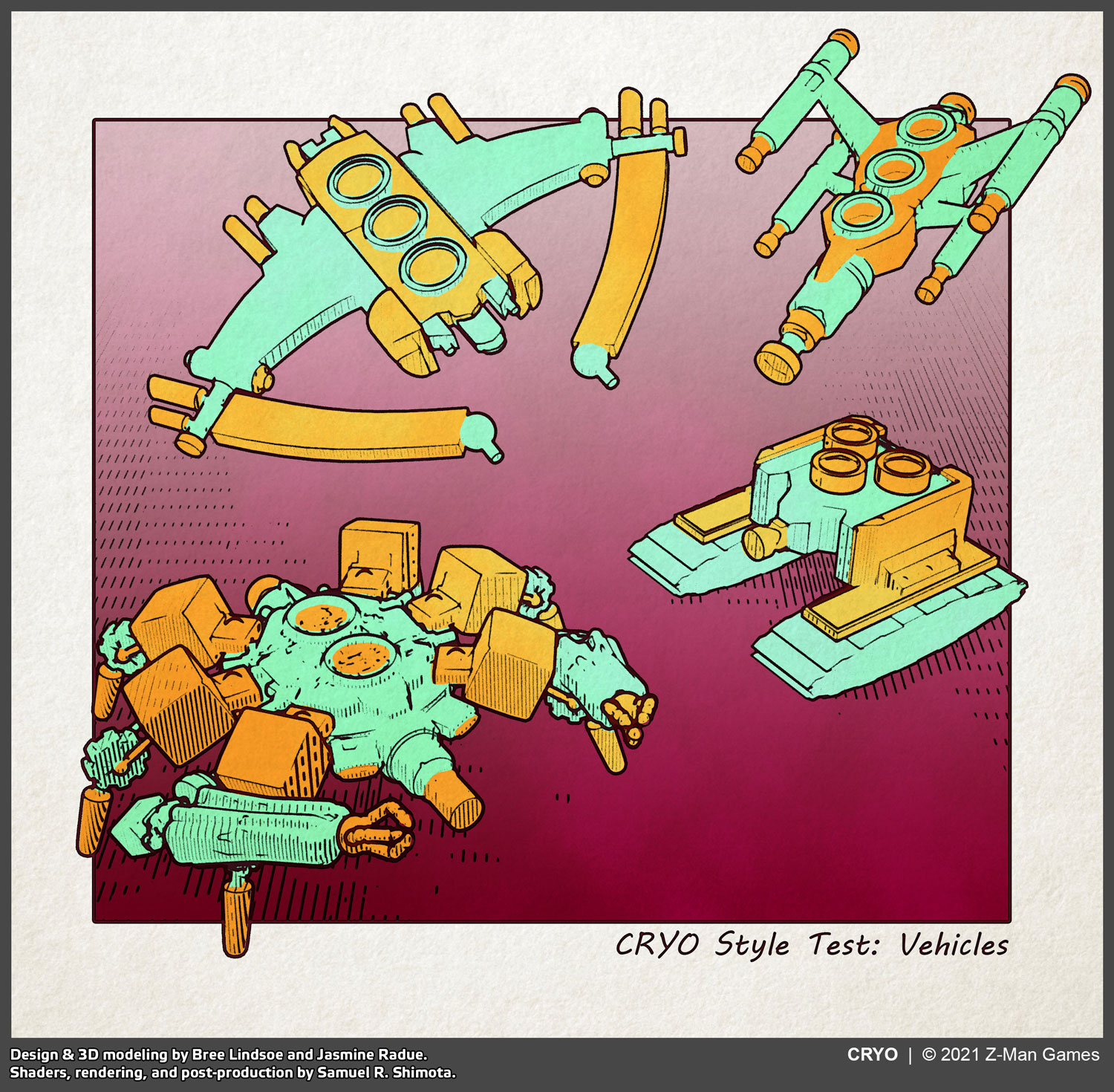
An early style test combining Blender and Photoshop. Steve Kimball asked for some visual aids for a presentation he gave to international partners and distributors to get them excited about the project.
Graphic Design vs. Illustration, Substance vs. Style
While often lumped together under the umbrella term “art,” graphic design and illustration are quite different. Graphic design is concerned with function (text frames, icons, etc.), while illustration is what many label as “artwork.” We at Z-Man work hard to keep things visually congruent, but we also generally accept that these two disciplines will look disparate. Normally, the goal is to make these things look complimentary in spite of their differences.
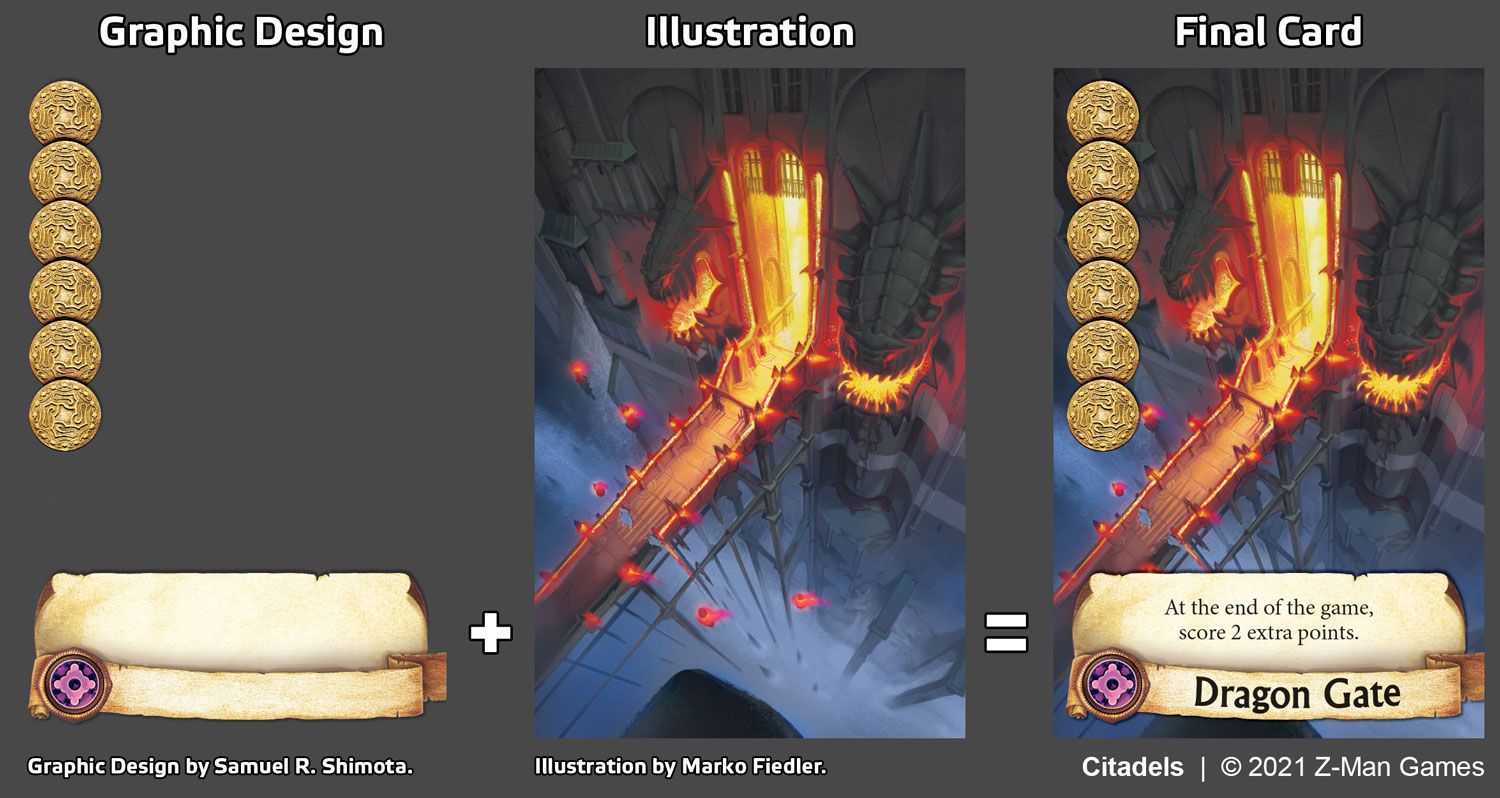
Graphic Design + Illustration (+ Text) = Final Card. Example taken from Citadels.
There are two other terms that are relevant for describing our process. Substance is an umbrella term that I use to describe the conceptual parts of Graphic Design and Illustration. It defines whether something is a plane or a car, a tree or a tower, a person or a planet. Substance also says if it’s steampunk, fairy tale, science fiction, or anything in-between.
Style, on the other hand, is the execution of substance. Style defines if what we see is made of fine lines or broad strokes, or if it’s in color or black and white. It determines whether we see gradients or crosshatching; if something is smooth or textured, clean or dirty, polished or spattered.

Substance vs. Style, within CRYO. More on our 3D rendering process below.
In Cryo, I wanted everything (with a few exceptions) to share a unified, consistent look. This meant making sure that every visual component in the game was done according to the exact same specifications; created by identical methods. Doing an entire game this way was an ambitious undertaking, especially with a team as small as ours. It required a novel approach.
Planning and Setting Expectations
As a matter of course for approaching design work, my team and I do a lot of research. We find and dissect reference material. We spend time identifying specific features that make visual things work, and we set clear expectations for what we intend to accomplish. All this before we ever start actually making anything!
As can be expected from any great art movement, the influence of BD’s–and Mœbius’s style in particular–has spread worldwide. There are many contemporary artists who are exploring similar themes and styles. When we were creating mood boards and gathering reference material for Cryo, we went on many deep dives into the art community and found a seemingly endless well of inspiration. If you like this sort of work, there is a lot of phenomenal stuff out there to be found!

Early shader tests, rendered entirely in Blender.
When it came to defining the visual expectations for Cryo, I was methodical. I built a document that defined two “Graphic Pillars.” Functionally, these were Substance vs. Style. I declared that Cryo was to be “Space-Faring, Esoteric Science Fiction” in a “’Neo-Retro’ Manga/Comic” style. This was my own unreasonably verbose terminology for something not-easily described, as a professional rather than academic (we’re just trying to get a job done, don’t @me).
Notable visual style beats that I defined were:
- A hand-drawn look featuring fine linework.
- Outlines & textural linework.
- Organic looseness, with an overarching sense of precision and deliberateness.
- Balance of fine detail against sparseness.
- Immersive, realistic scale with accurate three-dimensionality.
I noted some visual “considerations,” as well. These were a little more under-the-hood:
- Physical scale: thickness of lines and size of details should be considerate of the actual, physical print size of components, and consistent throughout product.
- Color palette: colorful, with bright accents that are more saturated. Taking inspiration from psychedelic BD reference materials, but more accessible to a broad audience.
- Color vs. Linework: colors should feel airy and light, balanced against linework that feels grounded and consistent.
- Organic: overall style should evoke pen-and-ink, watercolor, gouache, and airbrush.
- Dimensionality: everything should have depth and dimension, whether implied (e.g. shadows) or direct (i.e. we see it).
On the substance side, I wanted to make sure a couple of things were kept in mind:
- Internal Consistency: we are building a universe, and each part should play into the whole, in order to feel cohesive and believable.
- Slapdash and cobbled: the general technology used by the colonists within the game universe is fabricated into small chunks/pieces and hastily assembled. Time is of the essence, as they are struggling to survive, and this reality should be reflected in all of their technology.

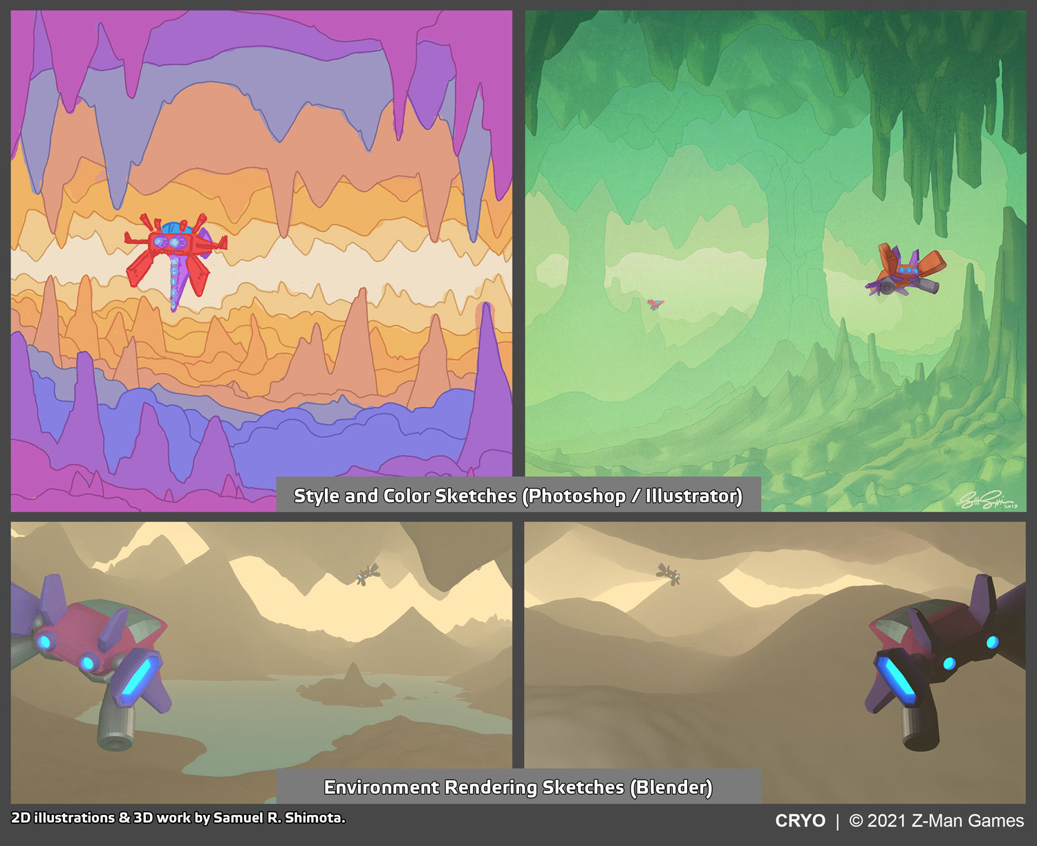
More style tests for Steve to show off. These are early iterations of the same caverns that were eventually published in CRYO.
The Team
 We had a very small, dedicated team working on Cryo. Jasmine Radue (Graphic Designer, by title) was responsible for implementing a consistent style across the many components of the game. Specifically, Jasmine designed the player board and ship card layouts, including modeling the 3D art for those pieces. Jasmine also created the iconography and 2D graphic design elements, handled overall typesetting, and was responsible for project and file management. Her strong attention to detail, and her consistent, high-quality design aesthetic helped make Cryo easy to read, visually cohesive, and especially smooth to play.

Bree Lindsoe (Art Director, by title) was responsible for concepting, designing, and modeling the various ships for cards and biomes for cavern tokens. Bree is a skilled 2D artist and it was exciting to see her concepts evolve as she brought them into 3D space. Her work is felt throughout the execution on final style across the game, as her meticulous linework and sense of color brought the visuals to life. I focused on designing and modeling the colony ship, the board, and cover artwork; doing style R&D; and designing the overall art production process. The three of us working in tandem produced the game as you know it now.
Process and Pains
The volume of content in Cryo was compounded by my expectations for consistency. This required a process that separated substance and style, so that each could be pursued independently. Using Blender (our 3D software of choice–see blender.org) we were able to design, model, and lay out everything in 3D; making confident progress on substance while separately iterating on style.
Early in the process, the salient question was asked, “why don’t we just illustrate this whole thing by hand? Aren’t we going to spend just as much time learning Blender stuff as what we’re going to save by using Blender?” That skepticism wasn’t wrong–by the time we finished, Cryo had cost practically countless hours of R&D, and we left much on the proverbial cutting room floor. I was stubborn, however, and I’m a teacher at heart (literally, I was an art teacher). I knew that, even if we spent a lot of time learning and experimenting, it wasn’t going to be a waste. My team went into Cryo without a lot of Blender experience and came out the other side hardened professionals. They rose to the challenge and brought the vision to life.

Early ship design sketches. These predated our decision to design ships that were loosely evocative of, and named after, animals.
I was confident that Blender could do what we needed to do, but the process was slow to evolve. Since we were iterating on style, the final look of the game was shifting and changing week by week. Progress was happening, but nobody knew exactly what the game was going to look like in the end. Alongside raw 3D renders, I would include style tests in our reviews. However, these were always paired with a caveat: “this isn’t quite done,” or, “I’m not really happy with this yet, but we’re getting closer…” I felt like a broken record–constantly asking for a lot of trust from everyone on behalf of the Creative team. And, for that matter, I was constantly asking for a lot of trust from within the Creative team.
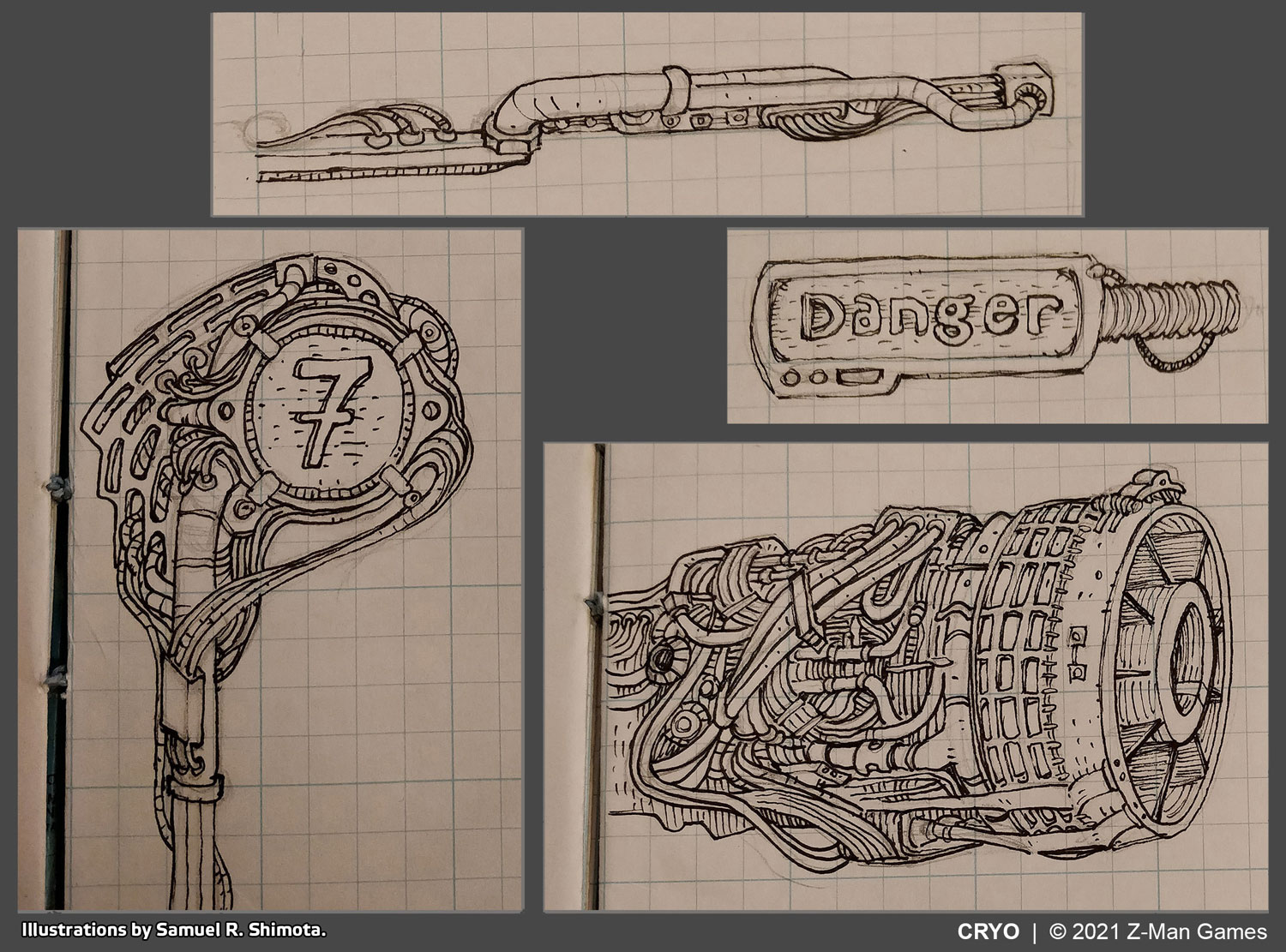
Early style and substance sketches.
To help keep my brain focused during meetings, and because my hands get restless, I do a lot of doodling. Like many artists, I have a long history of getting called out by teachers for drawing in class. Likewise, I have a long history of defending myself with the unconvincing argument that I was, in fact, paying attention! Though I’m hesitant to admit it, my design for the colony ship mostly took shape during Management, Production, and Licensing meetings. This was in the “before times” when our meetings were 100% in-person, and occasionally my coworkers from other departments would ask to see what I had been working on. I think they were often surprised to see stuff like this:
Isometric sketch/design of CRYO’s colony ship, created with Procreate on an iPad Pro.
As I often do when I’m exploring uncharted territory at work (e.g. unfamiliar art styles, processes, and/or subject material), I will integrate relevant techniques and studies into my personal work. While working on Condottiere, for example, I was doing a lot of watercolor in my spare time; experimenting with the relationships of watercolor pencils, ink, and gouache. I planned for the Cryo board to be rendered isometrically, so I was practicing isometric drawing in my own sketchbook. I was also regularly doodling in the BD sci-fi style and doing little animations using variations on my Blender shaders. I was steeped in this project nearly every day, nearly every week, for almost a year.
Style sketch excerpts from my sketchbook.
Final Product
On the style side, I had hopes that I could design a shader to fully emulate a hand-drawn look. I struck on some cool effects–cel shading and cross-hatching shaders that looked really neat. I was never quite satisfied, however–the results always either looked too digital, or not enough like the specific style we were trying to produce. Eventually I gave up on the idea that we could simply render out final graphics, and I conceded that we would need a “human touch” after all.
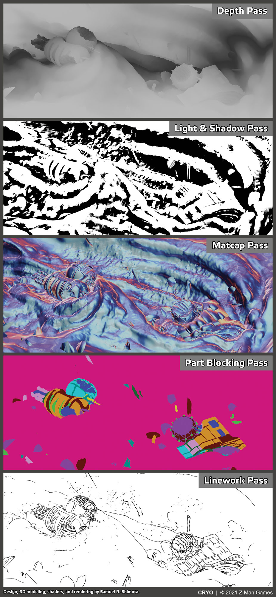
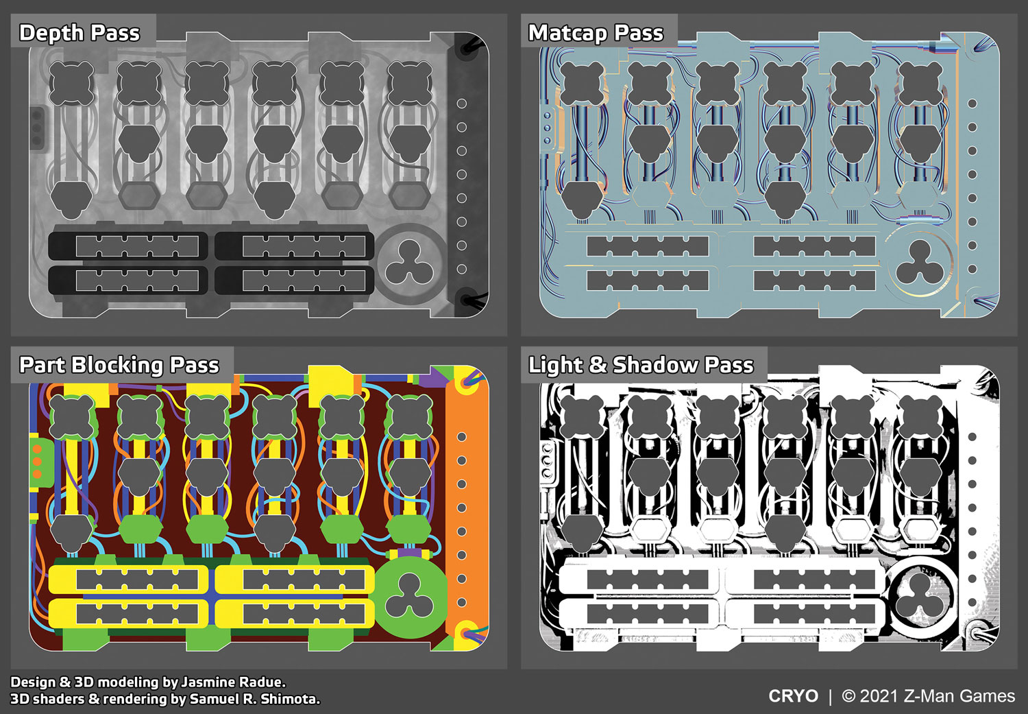
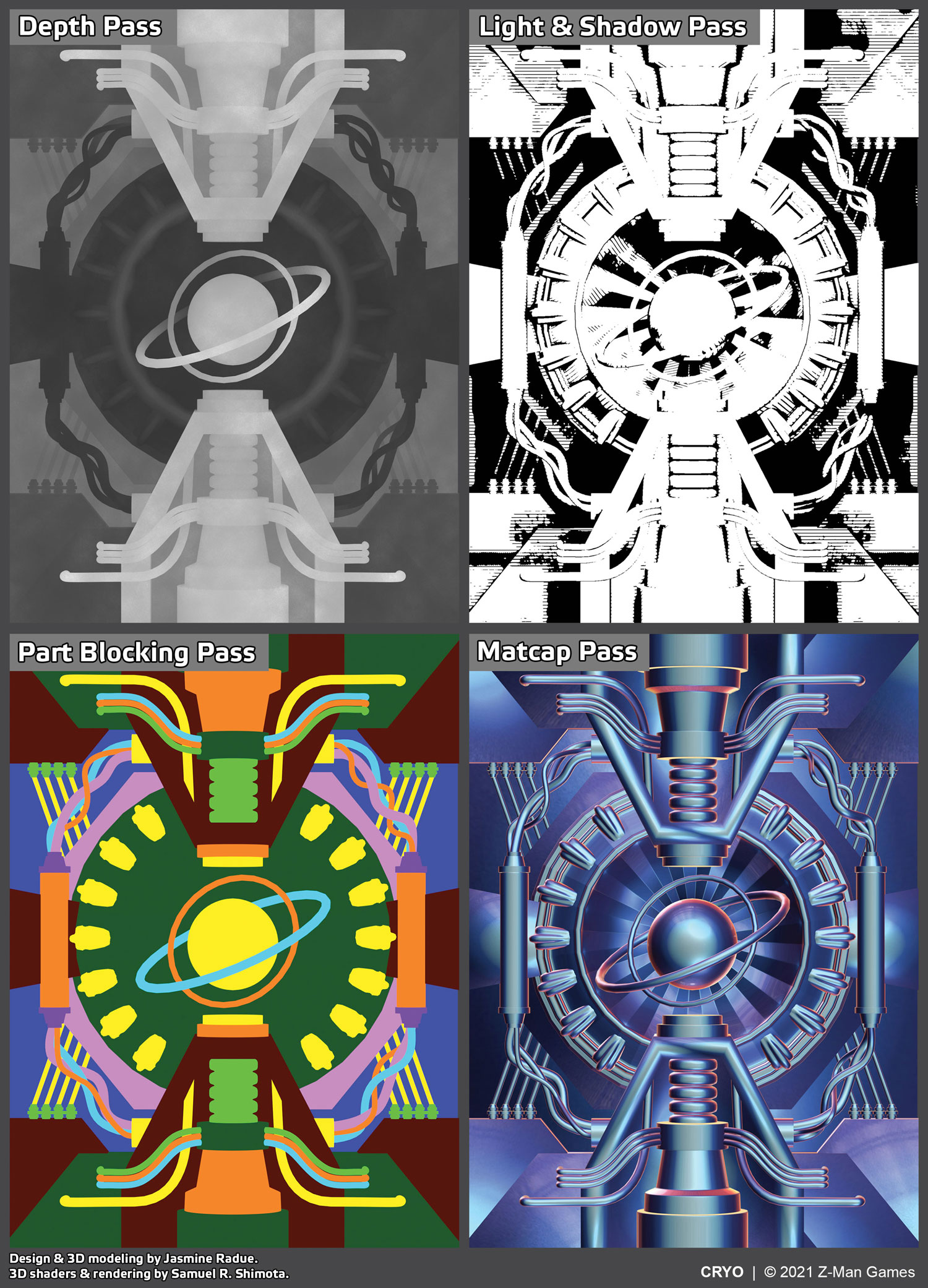
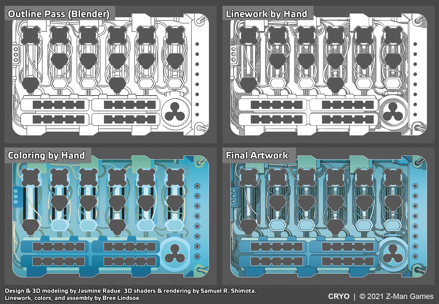
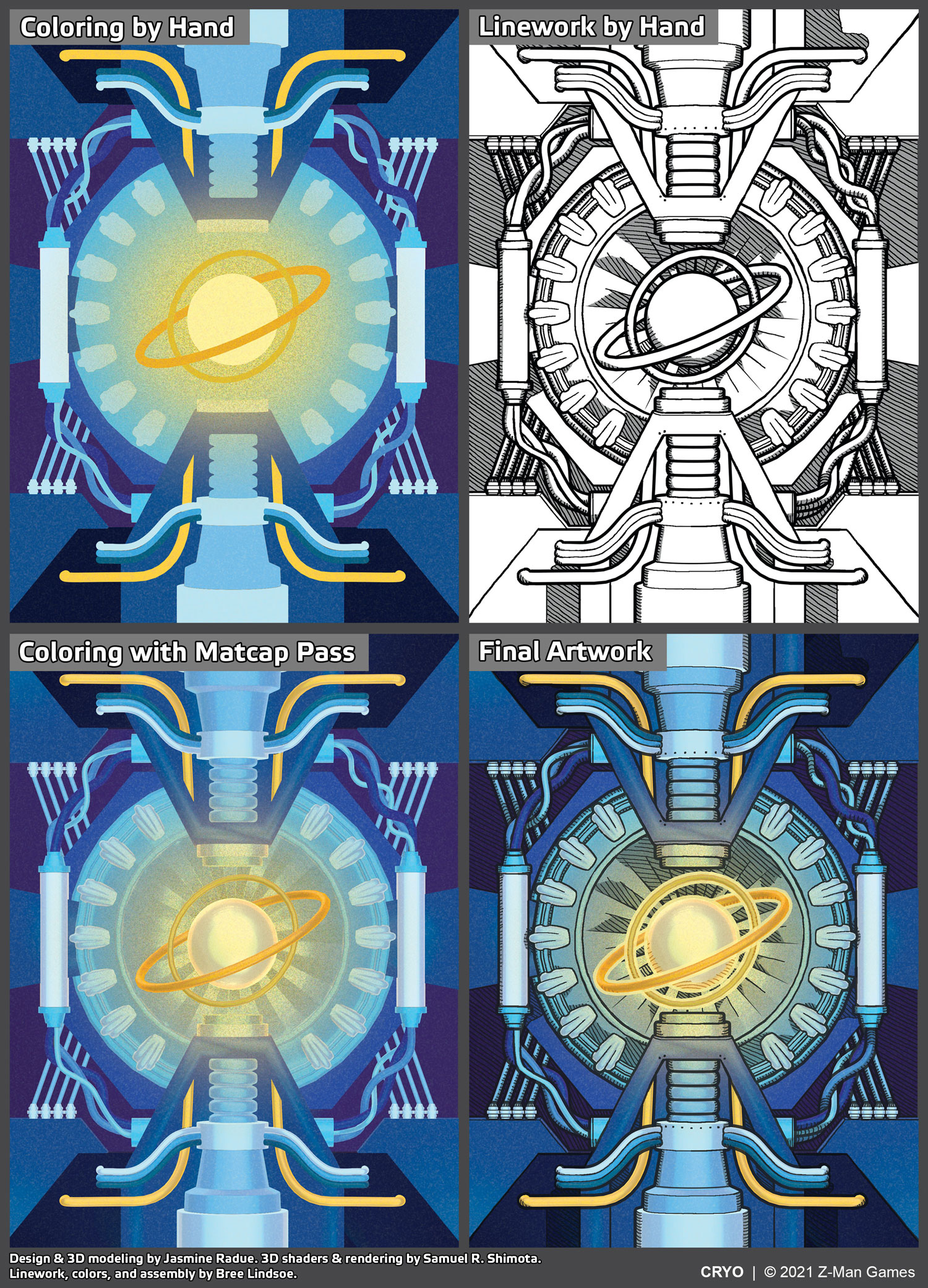
To implement the final style, we rendered a number of “passes” for every component and illustration in the game. A “pass,” in this case, refers to a layer to be used for post-production:
- Depth. This is a black and white shader that makes it easier to discern a broad sense of dimension within the scene. Objects appear more as silhouettes.
- Light & Shadow. This is a high-contrast shader that accentuates light and shadow within the scene.
- Matcap. This full-color shader accentuates the shape and contours of 3D surfaces. Matcap textures are often used for sculpting in 3D because they typically make it easier to discern subtleties.
- Part Blocking. This pass shows every individual object as a bright, solid color. This was used to easily see all separate objects in the scene, and to help create selection marquees and masks for coloring objects in Photoshop.
- Linework. This is also referred to as “cel-shading,” “toon shading,” or “freestyle.” Objects are outlined according to a number of variable parameters.
A small section of board, showing the Blender passes and assembly of final art. The 2D graphic design elements that are seen on the final board were done by Jasmine Radue.
After rendering, these passes were assembled in Photoshop, where Bree hand-inked (well, digital ink) linework over the top, colored, and assembled everything. The depth, light & shadow, and matcap passes were used to add additional, subtle dimension and texture to the images.
Blender passes and assembly of player boards.
This process was applied to every component in the game, giving the entirety of Cryo the consistent, unified style that I had envisioned. Seeing those last few steps come together, I felt something indescribable. Over a year filled with ambition, inspiration, uncertainty, doubt, skepticism, trust, determination, and resolve, we were all exhausted. And it was worth it.
Blender passes and assembly of card backs.
The community’s immensely positive reactions to the visuals of Cryo bring literal tears to my eyes. This project was deeply personal for me. It was an expression of things I love most in media. It brought together the lenses that are my own history, interests, and my career in tabletop games, and focused them all on one unified goal. It challenged me as an artist, and as a leader. It is an attestation to the skill and determination of my team; an embodiment of their ability to rise to an incredible challenge. It is a personal reminder that I have a remarkable job. I am deeply thankful to those who appreciate what we’ve done, and to you–for reading this account. I hope you’ll come back again.

